

In “Web Design Principles to Improve Conversions: Part 1”, we discussed above and below the fold. We also found out that putting all content above the fold doesn’t apply to most websites; and we’ve got samples to prove it. We also looked at how to create a professional looking website by working with whitespace or negative space.
In this article, I will discuss working with fonts and how to use them to compel action. Next, I’ll expose why working with the right combination of colors is the right thing to do. Lastly, I’ll give you a simple web design layout to improve your conversion by observing how your visitors scan your site.
Fonts for success
Are you having a hard time convincing people to fill an application form? Is your headline readable enough to encourage interaction? Does your blog attract readers in droves?
If not, maybe you should be looking at your fonts.
Researchers Hyunjin Song and Norbert Scwarz conducted 3 studies to show how fonts affect comprehension, commitment and impression. In the first study, they asked a group of students to read two sets of exercise routine printed in: a) Arial, 12 point and b) Brush, 12 point. The students were to estimate whether the exercise is easy to follow or not based on how the manual was written.
In case number 2, the students were asked to read two versions of a Japanese roll recipe printed in: a) Arial, 12 points and b) Misral, 12 points. The participants were asked to estimate how long to prepare the dish and their willingness to do so.
In case number 3, the students rated how much skill is involved in preparing the dish based on the materials they’ve read.
Here’s what the researchers have found out:
- Exercises would take less time and feel “quicker” if the font was easy to read.
- Participants reported their willingness to make the exercise or prepare the dish when it was described in an easy-to-read font.
- A product (i.e. Japanese roll) requires more skill to prepare when it was described in a hard-to-read font.
Their special report, “If it’s Hard to Read, It’s Hard to Do”, clearly indicates how you can take advantage on using fonts to compel readers into action. As Neuromarketing suggest:
- “If you want to convince customers that your product involves tedious steps to make, or that great skill is required to deliver the service you provide, slow the reader down with harder to read text and big words.”
- “… if you need to convince a customer, client, or donor to perform some kind of task, you should describe that task in a simple, easy to read font.”
Alternatively, you can bold some text to highlight a message and increase their size to get attention:
Colors: Combinations matter
There’s no such thing as “The Best-Selling Color”.
Period.
And even if it exists, do you want to live in a world where everything is blue, red, or yellow because it’s “The Best-Selling Color” ever? I don’t.
I believe it’s all about the right combination. It’s how you mix strong colors with the gentle ones. The darker hues from the lighter shades. Mixing the right blend of colors can go a long way. Remember, humans are visual creatures. And it only takes a homepage like this to scare your prospects away: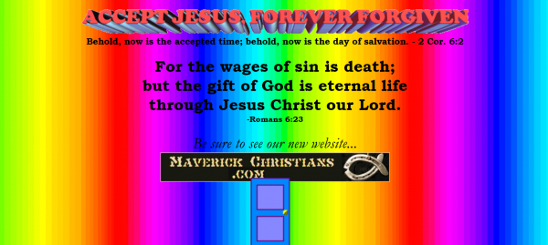
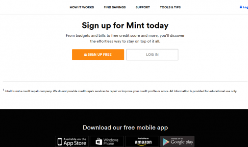
Take a look at Mint:
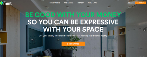
The dark background compliments the headline printed in white. Green was added to represent the company’s color scheme and to bring balance. Orange spotlights the “sign up free” button to tell visitors what to do next.
As you can see, each one has its purpose without overpowering one another.
Here are some helpful resources about the right use of colors:
- “How do Colors Affect Purchases?” – Kissmetrics’ infographic on color psychology
- Accessibility Color Wheel – Use a color wheel to find out if your combination is a hit or a dud.
- Colour Lovers – Use their templates as the layout of your website.
“F for Fast”
Thus says Jakob Nielsen in his article, “F-Shaped Pattern For Reading Web Content”.
A user's tendency to scan your site isn’t different from the way they read a book: left to right, top to bottom.
By using this natural reading behavior, we’ll notice an “F” pattern where:
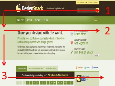
- Visitors start at the upper left corner of the homepage and move towards the upper-right corner – forming the first horizontal bar of letter “F”. This is where your logo and navigation bar is usually located.
- Next, they will jump to the second line and do the same pattern as before – forming the second horizontal bar. This second part shows your headline, a sub-headline, an image and terminating with a sidebar consisting of your latest articles,
social sharing widgets, a call to action, a search bar or your sign-up form. - Lastly, they will scan the bulk of the content in a vertical, downward pattern. This is where the rest of your content is located.
So, what can we learn from here?
- If you have something important to say, it’s best to put them in the top portion. Don’t leave your visitors guessing. Allow them to explore your site by putting navigational tools like a search bar or menus.
- Users are always on the go. They will leave your site if they don’t see anything beneficial. The next section is your chance to say your benefits by displaying a powerful headline. The opposite side should encourage interaction. Put widgets or call to actions so users can try your services right away!
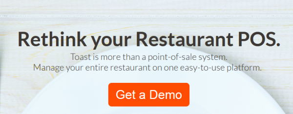
- If your customers have reached all the way down the 3rd bar, it means you’ve got their attention. All content in this section should sustain the momentum you’ve built. Bring out your best content and show them what you've got by including testimonials, an FAQ or an explainer video. Take it up a notch by providing links to case studies or free demos. Lastly, don’t forget to end your page with another set of call to action:
Conclusion
There’s a reason why high-converting websites stay on top. They know how to turn readers into subscribers, doubters into believers and leads into buyers. Your design principles should work hand-in-hand to drive your message across prospects. It has to be functional. It must have a purpose.
And your purpose: to guide your prospects by the hand; to be with them every step of the way.
There’s no point in making your site beautiful if it can’t convert. There’s no hope in well-written content if your design scares away your prospects.
Let me leave you with two quotes to ponder as you think about a high-converting web design:
“Content precedes design. Design in the absence of content is not design, it’s decoration.” -Jeffrey Zeldma
“What separates design from art is that design is meant to be… functional.” ― Cameron Moll
I help businesses and marketers build marketing and sales systems that drive leads and scale with ease.
Not sure where to start? Take my marketing quiz and get personalized next steps.


