

We've talked about designs before – from mistakes you have to avoid to design principles that guarantee high conversion. However, these posts center on general web design. In this article, I'm focusing on landing pages.
Landing pages are the pages your visitors land on after they've interacted with your advertising funnel. This advertising funnel could be in the form a PPC campaign, organic search result, or a pre-ad content. Landing pages come in different forms, but their main functions are to inform and to convert.
Right now, I'm going to give you my top 6 must-haves of a good landing page. After completing this article, you'll have an idea of a landing page that drives good business, converts more visitors, and lands better transactions.
Headline
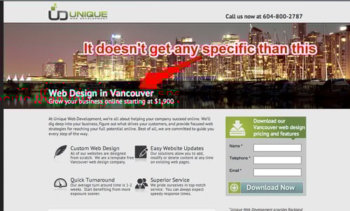
The headline of an effective landing page is big, specific, and benefit-driven. When I say “big”, I mean it has to be readable on mobile phones and other handheld devices. Fortunately, you can refer to this site and find out if your headline looks good on everybody's mobile device. You can also visit Google's Mobile-Friendly Test.
Next, your headline has to be specific or target-driven. Remember, you can't be everything to everybody. It has to focus on a niche or group of individuals. That way your visitors won't be confused.
Take a look at this example:
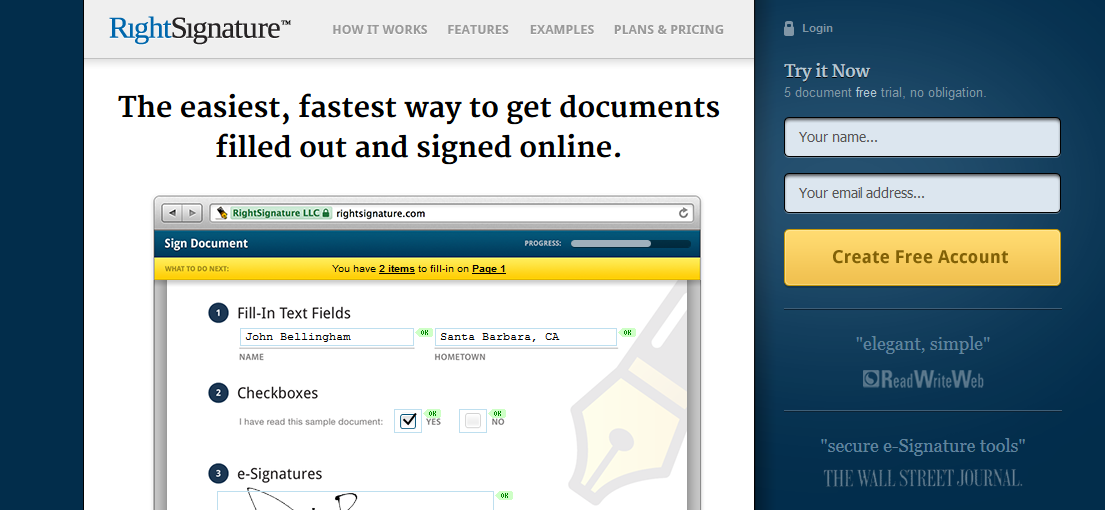
Finally, your landing page has to state the benefit of your campaign. The financial niche never fails to fascinate me with their unique, attention-grabbing benefits. There's no second-guessing about what they bring to the table and they discuss it well.
Just like this one from RightSignature:
You can include a sub-headline to reinforce your benefits. What this does is give a specific detail on how your business can deliver the benefits.
Bullet Points
There are two types of visitors: scanners and jumpers. Scanners check your landing page piece-by-piece. They scrutinize every word and element to support their decision. On the other side are jumpers. Just like White Rabbit of Alice's in Wonderland, they don't have time to skim through your page. They want instant information pronto!
Bullet points cater to jumpers – and scanners as well – since they tend to summarize your offering. Depending on your goals, a good bullet point tells the reasons why you need to take action. Or it includes a set of benefits your client will enjoy once they sign-up:
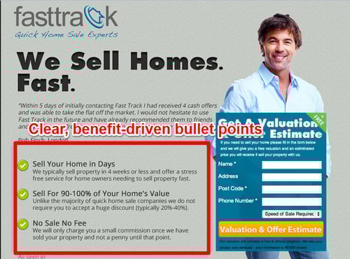
Make it short and sweet. Get to the point as fast as possible since most visitors are impatient nowadays – especially scanners. Include numbers whenever possible to add credibility.
Image and video
Your landing page has to cater to different types of people. You have to understand there are customers who are attracted to images. Some get excited by compelling videos while others appreciate detailed articles. So as much as possible, include text, graphics, and video on your landing page. What's more, putting videos on your landing page helps you explain your product even further, especially if it's highly technical.
Customer Testimonials
According to Dr. Robert Cialdini, author of "Influence: The Psychology of Persuasion", we need some form of validation in our action. And what a better way to find these reasons than by looking at the people who have done it before – a.k.a. "Social Proof".
Our premise is that since a lot of people are doing it, then it must be correct.
According to studies, adding social proof can skyrocket your conversions:
- In a study conducted by CompUSA and iPerceptions study, 63% of consumers are more likely to buy from a site that has product ratings and reviews.
- Over 70% of Americans look at product reviews before buying.
Putting customer testimonials inside your landing page takes advantage of this principle. Not only does it give your prospects a reason to take action, it helps them realize that your product serves them well.
How to create a convincing customer testimonial:
- Include your customer's image - It shows that your testimonials are authentic
- Get testimonials from your target niche/audience
- Numbers give your testimonials credibility
Trust Seals
Including trust seals on your landing page tells a great deal about your business. Trust seals indicate that you're dead-serious about your business and you've gone to a great length to put your company through a series of tests and validations.
Trust seals are vital to your business. In fact, some surveys indicate that almost 61% of Americans decided not to buy from someone without a trust seal.
And according to Baymard Institute's 2013 survey result, Norton was the runaway winner with 36% of the votes:
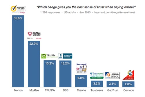 Source: Baymard Institute
Call-to-Action and Submit Buttons
A landing page is all about conversion: prospects to buyers and lurkers to subscribers.
To achieve your goal takes a specific set of instructions that you want your target to accomplish. Never leave anything to chance. Instead, be clear about the series of actions they have to do. That's what Square have done here:
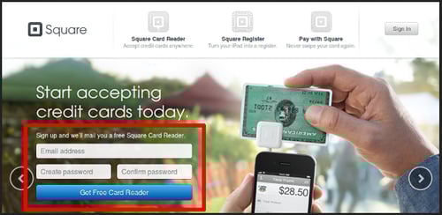
Besides including a clear instruction ("Sign up and we'll email …"), they added the word "Get” to encourage action.
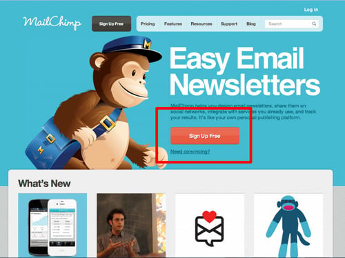
Not only should it be specific, your submit button has to give benefits as well. Doing so reinforces your headline's promise plus it promotes a "reward system" to those who complete the action – just like this one from MailChimp:
Do colors in your buttons count?
Yes!
A lot, actually. We humans are attracted to contrasts or colors that stand out from the rest. Working on this principle, a light-colored background requires a darker colored CTA:
Still confused on how to blend contrasting colors?
Then check out Paletton.com. This is a website that helps you design your color schemes.
Conclusion
How important is your landing page?
Let me give you 5 reasons:
- Generates leads
- Gives your offers a place to stay
- Profiles your customers and collects information about them
- Separates prospects from tire-kickers
- Serves as a consultant that tells you whether your campaign is a hit or a dud
Reinforce the effectiveness of your landing pages by making sure you have included all vital elements.
These 6 must-haves are just a primer of what you should do. The most important thing to remember is to find out your customers' problems and offer solutions.
Don Draper, of the highly-successful Mad Men TV series, said it best:
"When a man walks into a room, he brings his whole life with him. He has a million reasons for being anywhere. Just ask him."
Focus on these words and you'll have a high-converting landing page in no time.
I help businesses and marketers build marketing and sales systems that drive leads and scale with ease.
Not sure where to start? Take my marketing quiz and get personalized next steps.


