
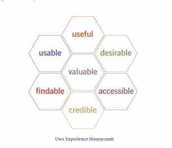
 A couple of months ago I made this comment when talking about user experience: “UX = design + functionality + purpose”. It is related to Peter Morville’s User Experience Honeycomb.
According to him, there are 7 facets of user experience:
- Useful – Does my content fulfill my market’s needs?
- Usable – Is it user-friendly?
- Desirable – Does it evoke positivism and good feeling? Is it visually appealing?
- Findable – Is it searchable on the Web? Can my visitors easily navigate around my site?
- Accessible – Can people with special needs visit and use my site? Can mobile users access my site?
- Credible – Is it trustworthy? Can people rely on my site to come up with a genuine, reliable content?
- Valuable – Does my site sends my message across effectively? Can it promote my business and foster good relationship with my prospects? Does it contribute to my bottom line?
For marketers and business owners, this is quite a handful. Which is why I decided to condense it into three elements:
- Design
- Functionality
- Purpose
Now, imagine your website as a stool.
Your business sits on top of it. And these three elements act as legs or pillars. Your presence is guaranteed a solid footing as long as these elements are present. Cut any of these legs and watch your business fall flat on the floor.
With that in mind, I’d like to discuss each one of them. My goal is to encourage you to examine your site. Find out if you have these elements in place.
Design
We are visual creatures. From Day One we are hardwired to use our sense of sight as a primary survival tool. We often judge something as an opportunity or as a threat based on how they look. When people visit your site, there are so many tunes playing in their head:
“What’s in it for me?”
“This site looks beautiful.”
“The fonts are pleasing to the eyes.”
“I love the colors. They totally match.”
“This site looks professional.”
Providing a wonderful user experience by designing an attractive site is your number one priority. Because research has proven that you’ve only got 50 milliseconds make a good impression. Your design should take advantage of this finite opportunity.
And it involves a specific combination of colors, layout, icon and font.
Take a look at this example from Mariusz Cieśla:
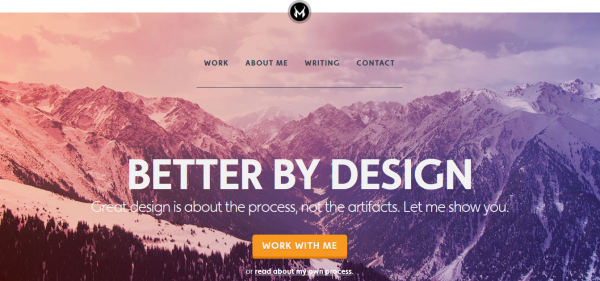
The homepage catches your attention by its hook: a mountain. The headline and sub headline are noticeable even at a distance. My monitor is about 20 to 25 inches from me and they’re still readable. The layout has enough negative space, allowing each element to stand out. You will also notice that he made his main menu black in contrast to the overall light background. And to top it off, he highlighted “WORK WITH ME” with an orange button.
The design alone should tell your visitors about your company. It should bring something that speaks about your branding. And where else can they find the essence of your branding, but in the “About Page”?
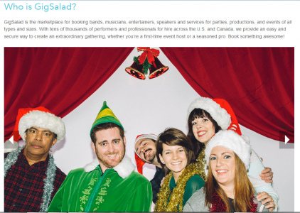
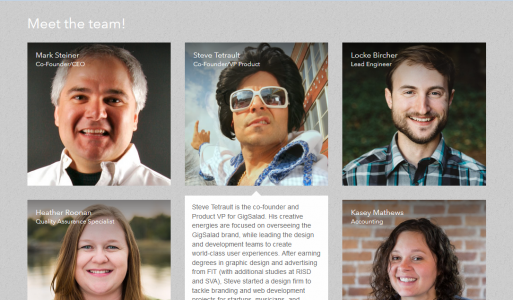
Take a look at Gig Salad, an online booking portal for event professionals and performers. Since they’re into parties and events, they put a casual, personable vibe on the “About Page”. The carousel shows random pictures of people doing fun stuffs – from baseball clinics to employees dressed as Elvis:
In the next example, each grid shows two images for every team member – normal and casual, funny and quirky. The twist is that you won’t see the quirky image unless you hover over the pictures:
Design gives your visitors a reason to stay – or not. But the experience won’t be complete if they don’t get the chance to try some features of your site.
Another aspect of a good user experience is to make your site easy to use or “functionable”.
Functionality
In business, having a functional website is one of the reasons people buy from you. Looks do count. But at the end of the day, people will judge your site based on how user-friendly it is.
Marketers who adhere to user design principles think of ways on how to make their site easy to use. So easy that even a fifth grader can complete a transaction without calling for her Mommy.
I found out that businesses owners can learn more about functionality by studying a web designer’s site.
Case in point, Andrew Jackson:
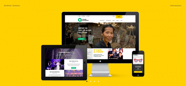
You can navigate around just by using your keyboard’s navigational keys. He developed it in such a way that each button sends you to different contents. He let go of obstructive menu tabs to highlight his portfolios even further.
Now, imagine your product has the same “freedom” – showcasing its features and benefits with just a push of a button.
Wouldn’t it be more convenient for your prospects? Wouldn’t they appreciate your products even more?
Lastly, a good user experience caters to a niche. Casual browsers might find you interesting. However, your business doesn’t exist for them. It doesn’t matter how beautiful or user-friendly your business site is. If you don’t address a specific need, your efforts will go to waste. A user must realize who you are, what can you offer and what makes you different.
You’ve got to have a purpose.
Purpose
In an interview for Digital Arts, Clearleft co-founder Jeremy Keith said, “The thing is, what you’re offering won’t be for everyone. The best thing for you is to make people aware of that as soon as possible, rather than stringing some along under false pretenses.”
In other words: Be upfront. Be honest in your motives. State your purpose. Then, let your prospect decide if they want to work with you or not.
People will connect with you if they feel your motives are genuine. That’s because they hate being manipulated. They hate snake oil salesmen. And you don’t want to be labeled as one.
Charities have the best examples of websites that use honest, succinct purpose to drive their initiatives. Take a look at I Remember – a foundation that raise awareness of Alzheimer’s:
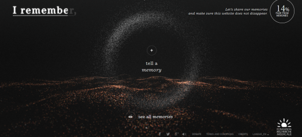
I Remember designed this site to mimic the condition of someone who suffers from Alzheimer’s. It opens up with a reminder that the site will gradually disappear if it’s not given memories. These “memories” are pictures downloaded from your computer, Facebook or Instagram account. You have to feed it with memories to keep the site from disappearing.
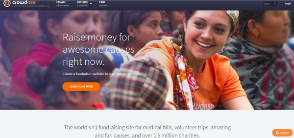
Another site that uses strong purpose to drive its message across is Crowdrise. It is a platform that allows you to create fundraiser websites:
Visitors won’t have to second guess what these sites are all about. And that’s what we should aim for: to attract the right customers by building your site around your purpose.
Apply these principles by streamlining your design. Forget about the bells and whistles. Stick with a central message that best represents your business. In a world where everything is a clutter, your message will surely stand out.
In summary, user experience covers important key points to help your site convert. A good design catches their attention. Functionality makes them stick and enjoy your content. Purpose helps them to remember you even after they left your site. Do not compromise one for the other.
Let me hear your thoughts about User Experience. Leave your comments below.
I help businesses and marketers build marketing and sales systems that drive leads and scale with ease.
Not sure where to start? Take my marketing quiz and get personalized next steps.