

Browsing with your smartphone has come a long way, hasn't it? Back when mobile devices were in their infancy, businesses could get away with sites similar to this:
If you’re like me, you’ve been through some bad mobile experiences, right?
- Small fonts
- Tiny icons
- Links too close with each other
Back in those days, there’s nothing you could do. Mobile devices were not ready for business transactions, social interactions and financial decisions. But times have changed. People moved on from their desktops and laptops to tablets and smartphones. Nowadays, financial managers are using smartphones to check on the latest market trends on Wall Street and consumers are more comfortable buying things using their tablets.
Sales of these gadgets are staggering. In its March 2015 report, Gartner said the 2014 sales of smartphone units surpassed the one billion mark (Source: Gartner, March 2015).
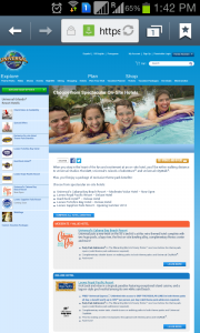
That’s why businesses had to adapt. They decided to build a dedicated site for mobile users. By making this change, people who visit them on laptop see this:
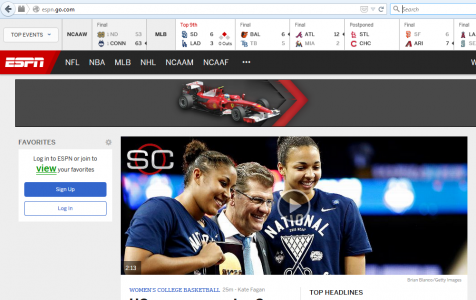
And that same site looks like this on a phone:

This set up is perfectly fine when we’re talking about big businesses who have a team of programmers and large, enterprise-grade infrastructures. These types of sites have complex mobile application requirements that demand focused resources. But for small businesses? I don’t think so.
A dedicated mobile site requires a separate codebase for desktop and mobile versions. Also, it will entail different SEO campaigns between desktop users and for mobile users. And developers need to continually refresh the system design to cater to future devices. This approach ensures that the site can adapt to some upcoming technologies (e.g. Wearable devices, smart TVs, browsers and smartwatches). Lastly, it will require regular updates to sync mobile contents with those of desktop’s.
However, if we’re talking about business owners – like you – who have limited time, manpower and budget, we need to change the setup. For you, building a responsive site is the best way to go.
A responsive design allows your site to render easily on any device. Imagine a pitcher of orange juice being poured into different types of glasses: the first one is tall, the second is short and the last is curvy. The orange juice in the tall one is the same as the other two. The only thing that’s different is the container.
And this feature can greatly benefit you.
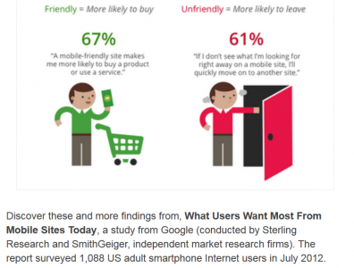
According to Google, consumers are more likely to buy from you if you are mobile-friendly:
Think about the benefits you'll enjoy:
- Because your site is fluid, you don’t have to tweak your web server every time a new handheld device debuts on the market.
- Protect your capital from maintaining separate sites.
- Offer an excellent user experience that leads to better interaction with clients.
- Streamline your workforce, save resources and allocate your operating expense into business development.
- Become more searchable by your prospects whether on PC or mobile.
- Share your contents in a wider audience quickly and easily.
On the other side of the coin, you might be asking:
“My current site is working perfectly well. I don’t need to build another one. I just like to make it mobile-friendly. Can you help me?”
Yes!
And that’s what professional web designers and developers can do for you. They can adapt your site to make it mobile-friendly. An experienced designer can turn your site from this:
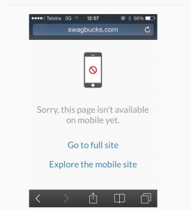 Courtesy of: Wtfmobileweb.com
Into this:

The market is always changing. As a business owner, you have to adapt. It all starts with making your website accessible to present and upcoming technologies. I know there are risks and expenses along the way: learning new technology, employing web designers and spending for upgrades. The good news is, the reward far outweighs the risks.
Martial arts superstar Bruce Lee once said:
“You must be shapeless, formless, like water. When you pour water in a cup, it becomes the cup. When you pour water in a bottle, it becomes the bottle. When you pour water in a teapot, it becomes the teapot. Water can drip and it can crash. Become like water my friend.”
Be flexible. Be adaptable. Be one step ahead of your competition. Contact me if you need help in making your site mobile responsive.
I help businesses and marketers build marketing and sales systems that drive leads and scale with ease.
Not sure where to start? Take my marketing quiz and get personalized next steps.