5 Most Common Oversights in Web Design
When you first embark on a web site design or redesign project, sometimes you’re distracted by the nitty gritty details: where are things going to go, what colors should be used? The website is also a shiny new thing you like to parade in front of others. Often, though, some of the most important things are overlooked and can leave you scrambling for a solution last minute.
Here are some of the most common oversights in web design:
Keeping your audience in mind
Who are you trying to talk to? Who is your target audience? You wouldn’t want a very corporate-feeling, B2B site when you’re trying to cater to millennials. The same goes for having inappropriate content for a site selling to C-level executives. This kind of disconnect can really make or break the website’s effectiveness.
Having a goal for every page
Every page on your website should have a call to action. The visitor should load the page and know what to do next, after reading the content. Is the page one of your blog articles? Get them to subscribe to the blog via email. Are you providing information about one of your services? How about a CTA to one of your case studies for client you did that work for.
Ability to edit the site
How easy can changes be made on a page? If you have a complex, proprietary CMS then it may be more difficult to get others to learn it and want to use it. If you’re using something like WordPress or HubSpot, it’ll be a cinch to have someone else on the team log in and post an article.
User experience and workflow
How well is the architecture of the site planned out? I’m not talking the layout of the page elements, but rather the user flow from one page to another. Are all of the blog pages linked? Does the navigation make sense, or would an additional breadcrumb navigation make sense for a site with a lot of content?
Responsiveness
Having a mobile site that is separate from your main site isn’t cutting it anymore. Instead, make it easy on your web master and visitors by having a responsive site. It should work well no matter what device is being used, whether a mobile, tablet or laptop.
Input from fellow designers
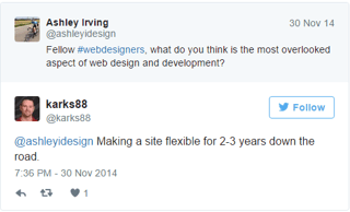
I asked a couple of other designers for their input on what the biggest oversights in web design are, and here’s what they said.
Katie Price - "Accessibility and Internationalization"
Gennia Holder - "Conversion and tracking. People want a beautiful site but don't know the best layout to achieve their goals - one that converts. Having a site where booking a consultation is your main goal will have a home page layout that's different from page where list building is your goal."
Nikki Swindle - "I’d say user experience. People get carried away with wanting this funky feature and that one but they forget to consider it from their visitors POV and how it will translate to mobile devices."
Trista Dedmon - "Content strategy and organization. A site should ideally be designed around well written and user serving copy, but we often jump ahead with design, and wait on content for waaaaay too long."

I help businesses and marketers build marketing and sales systems that drive leads and scale with ease.
Not sure where to start? Take my marketing quiz and get personalized next steps.


